Overview
Observe what the material shows.
Read the material through light
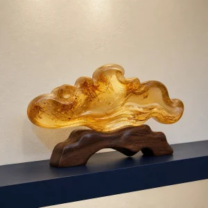
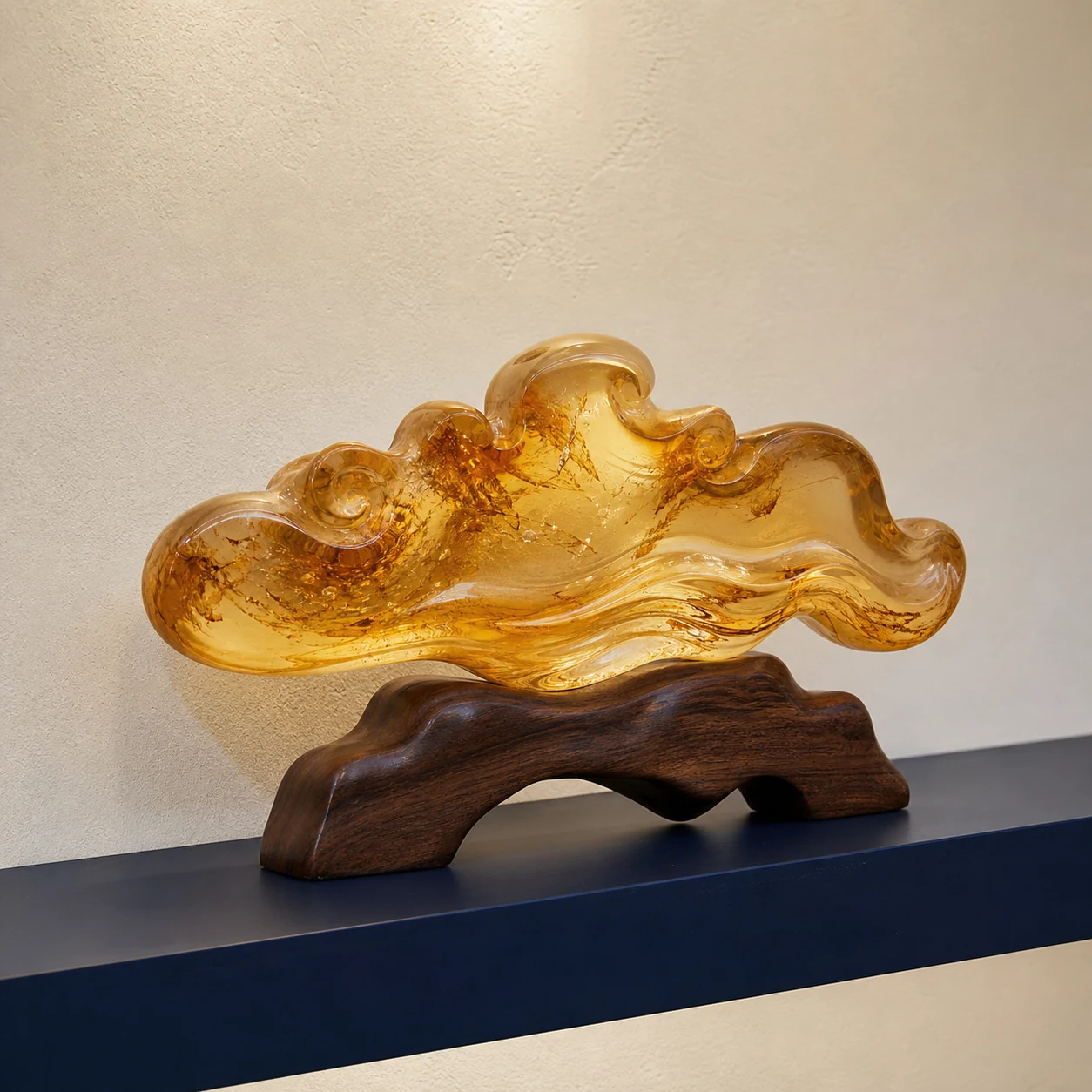
Amber-toned objects change with illumination. Clear edges, suspended details and transitions from honey to deeper brown become more visible as the viewing angle moves, while a dark background can make the same piece look denser. Product photographs should therefore include a neutral view as well as any dramatic backlit image. Use those images to understand appearance, not as a substitute for a precise material description.
Natural amber, pressed or reconstructed amber, composites and amber-colored alternatives are different materials. The correct description matters more than a romantic name. Check what the product page actually states, whether inclusions are natural features or design effects, and whether findings, adhesives or bases use other materials. If composition, provenance or treatment is important, request supporting documentation and keep it with the purchase record.
Compare finish, construction and scale
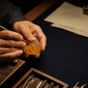
A polished face can bring depth and suspended detail forward; a softened or matte surface diffuses light and reduces glare. Neither finish is automatically better. Look for deliberate transitions, clean drilling, secure fittings and a base that supports the object without rocking. Bubbles, seams or uniform patterns may be relevant to how a particular material was formed, so assess them in relation to the disclosed composition rather than using one visual shortcut as proof.
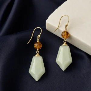
Dimensions are especially important because close photography can make a small object appear monumental. Compare height, width and depth with a familiar book, hand or shelf opening. For jewelry, review total drop, weight and fastening method. For a desk or shelf object, allow space around it so daylight can reach an edge without placing it in a window or on a hot surface. A considered scale usually creates a better presentation than simply choosing the largest option.
Plan display and gifting
Amber tones work well where light changes gently through the day: a console away from a radiator, a sheltered shelf or a work surface outside the path of spills. Use a stable, level base and lift larger pieces with two hands. Avoid narrow ledges, direct contact with rough stone or metal, and positions where a blind, door or cable can strike the object.
For a gift, separate the verifiable facts from the accompanying story. Include the material name, approximate dimensions and care notes, then add cultural or personal context only where it is welcome. “Connection” and “prosperity” are browsing themes that can frame gratitude or a milestone; they do not guarantee a relationship, financial result or future event. Confirm the recipient’s preferences and any exchange limits before personalization.
Care for warmth, surface and fittings
Keep amber and amber-toned materials away from sustained heat, strong sunlight, perfume, solvents and household cleaners. Wipe lightly with a clean, dry, non-abrasive cloth. Do not soak, steam or place a piece in an ultrasonic cleaner unless its maker gives material-specific instructions. Store jewelry separately in a soft enclosure so metal fittings and harder objects cannot scrape the surface.
Check clasps, cords, bonded components and display feet periodically. If a surface becomes tacky, cloudy, cracked or loose, stop cleaning experiments and contact the seller or a conservator familiar with the stated material. This guide offers general handling and cultural context only. It is not medical, therapeutic or financial advice, and it makes no claim that an object can create wellbeing, prosperity or any other outcome.
Cultural context
Meaning is context, not a guarantee.
Editorial themes: Connection, Prosperity
Symbolic associations are presented as cultural and editorial context. They do not promise medical, financial, relationship, protective or personal-performance outcomes.
Reading principles
Compare the object through disclosed facts.
Variation
Look for the stated range of tone, grain, inclusions and translucency rather than expecting identical pieces.
Finish
Read polish, edge, joinery and surface treatment together with clear scale photographs.
Suitability
Choose for the intended wear, room, handling and gifting situation.
Placement and use
Let scale and handling guide the setting.
Relevant contexts: Gift, Home
Use the dimensions, weight, stability and exposure notes on each product page. Keep display objects on a level surface and wearable pieces away from repeated impact.
Care
Begin with gentle, material-specific handling.
Follow the care note supplied with the specific object. Unless its material instructions state otherwise, avoid impact, prolonged moisture, strong heat, perfume, household chemicals and abrasive cloths.
When uncertain, contact client care with the product name and a clear photograph before cleaning.